selected works
/
A hub for investment products, research, and market insights
Overview
Gabelli, a leading investment management firm, embarked on a digital overhaul to better serve its users—ranging from institutional investors to individual shareholders. While the original website was functional, it lacked the visual clarity, responsiveness, and user experience standards expected from modern financial platforms. The challenge was to preserve the trust and authority of the Gabelli brand while making its web presence cleaner, faster, and easier to use.
Challenge
The previous iteration of the site felt dated and cluttered. It suffered from dense page layouts, a lack of visual hierarchy, and inconsistent spacing. Navigation was confusing and over-complicated, with redundant menus and a heavy reliance on small-text links. For users trying to find fund data or company insights, the experience was often frustrating, especially on mobile devices where the site was not optimized. Additionally, the visual design—particularly typography, spacing, and color usage—reflected older web conventions, which could affect credibility with new users.
Approach
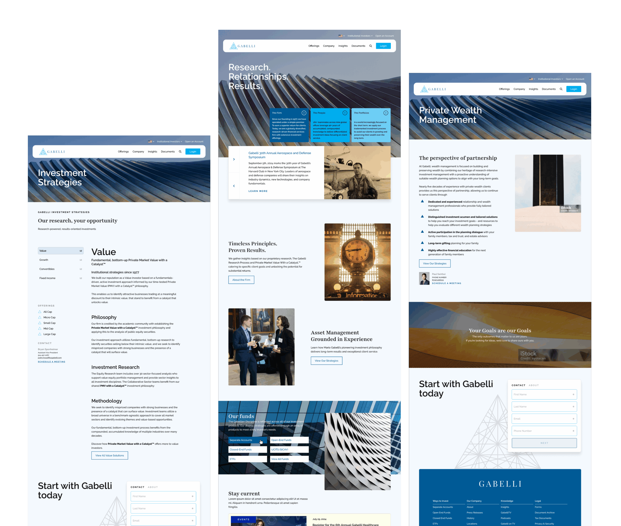
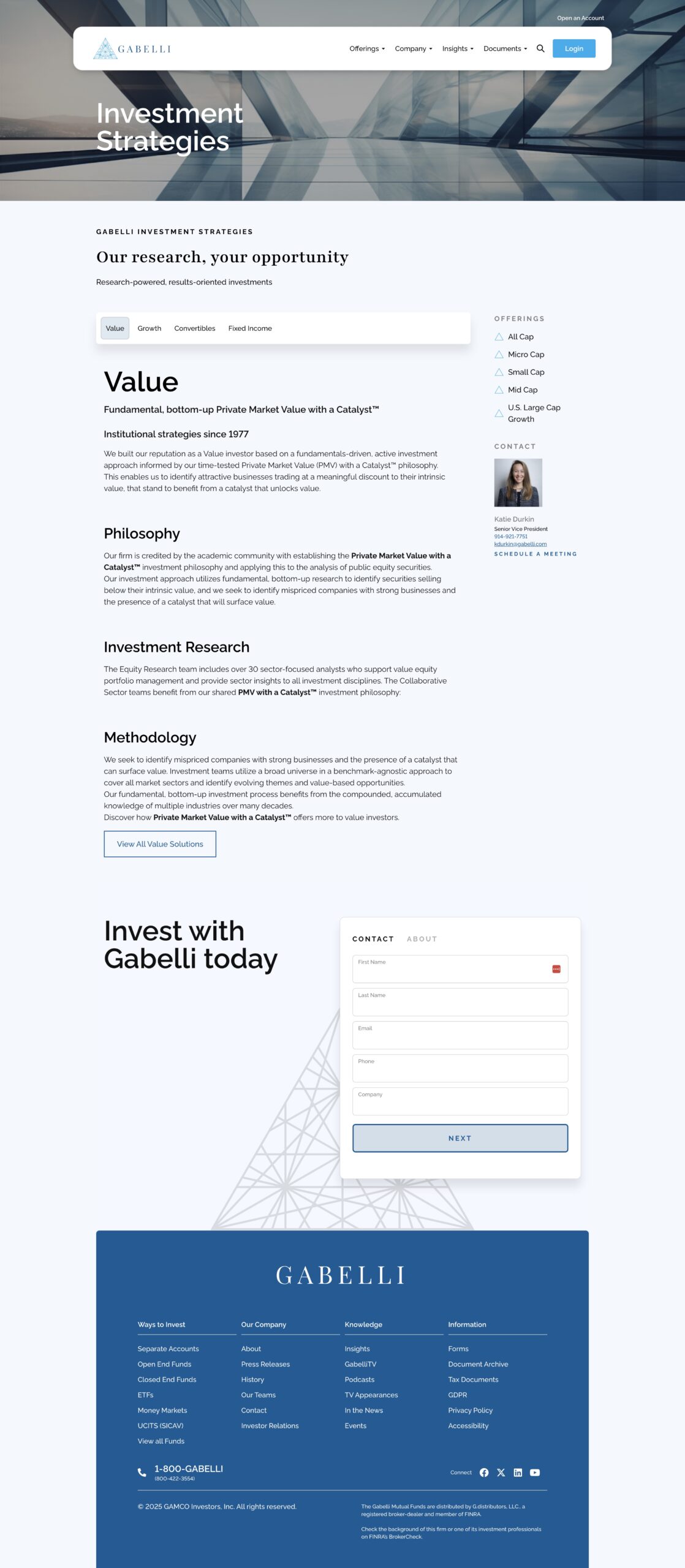
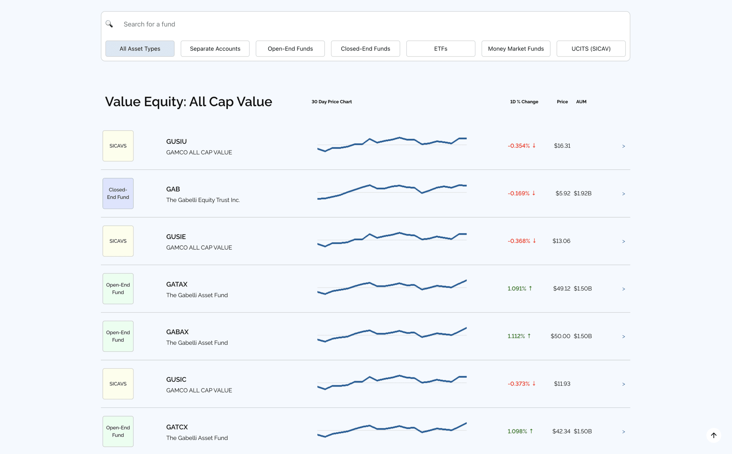
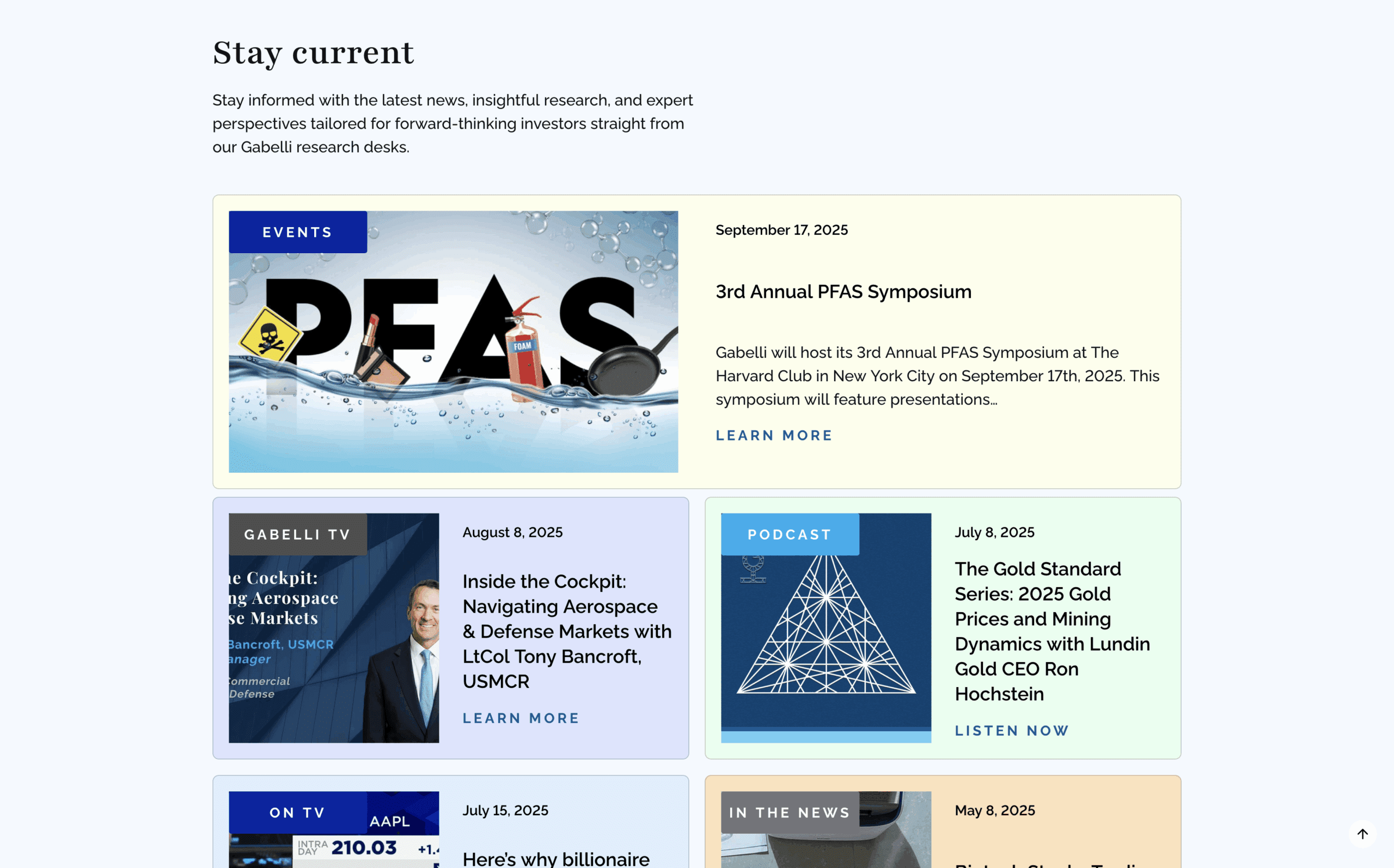
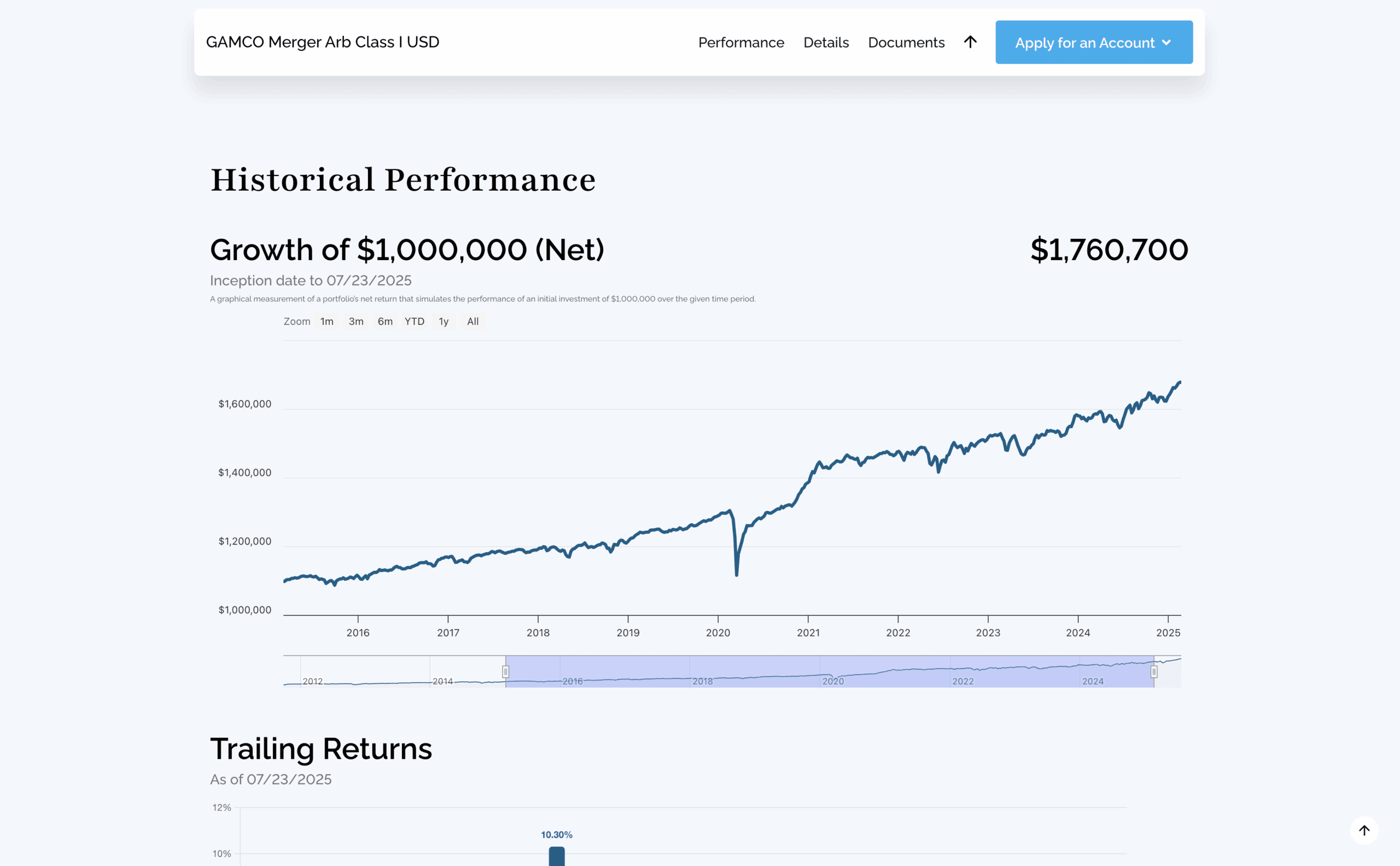
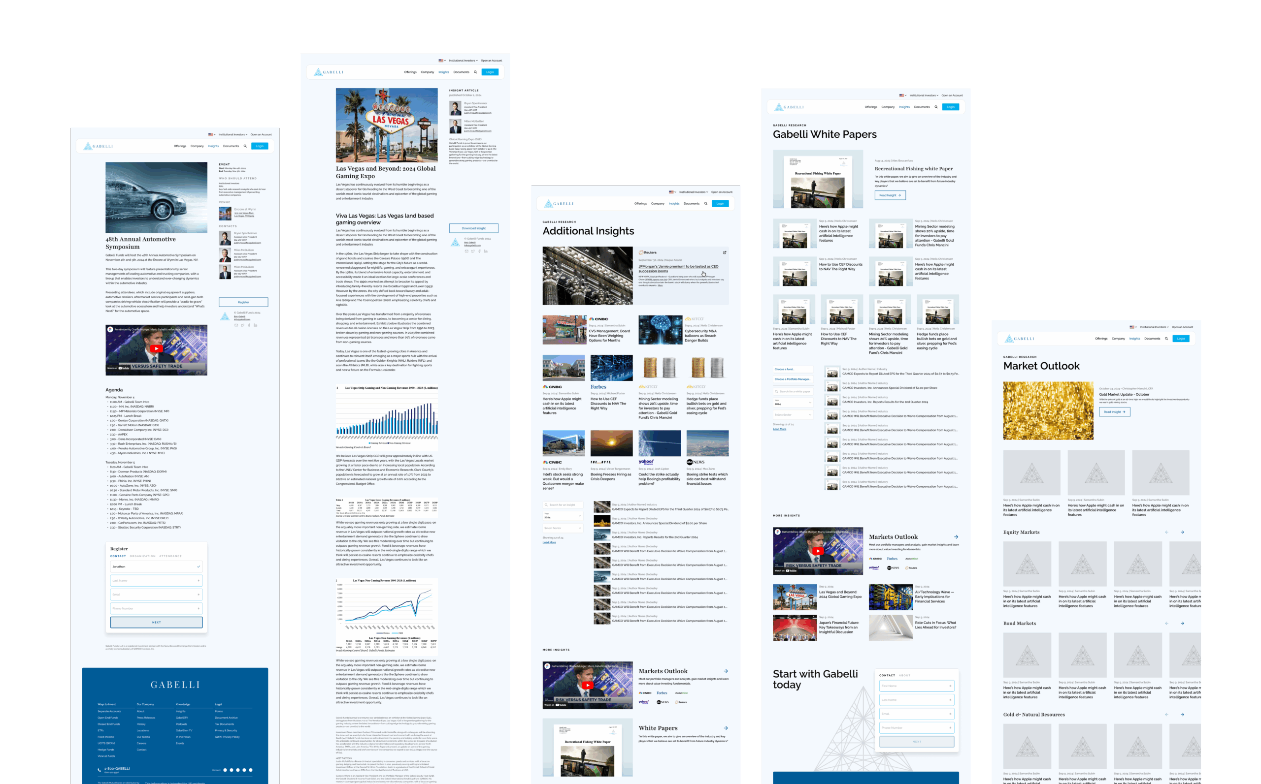
The redesign process was grounded in a user-first strategy, emphasizing both aesthetic refinement and technical performance. Visually, the new design embraced modern minimalism. The team used intentional white space, softer color tones, and cleaner typography to draw attention to key content without overwhelming the user. Consistency became a core theme, with clearly defined styles for headings, buttons, and interface elements.
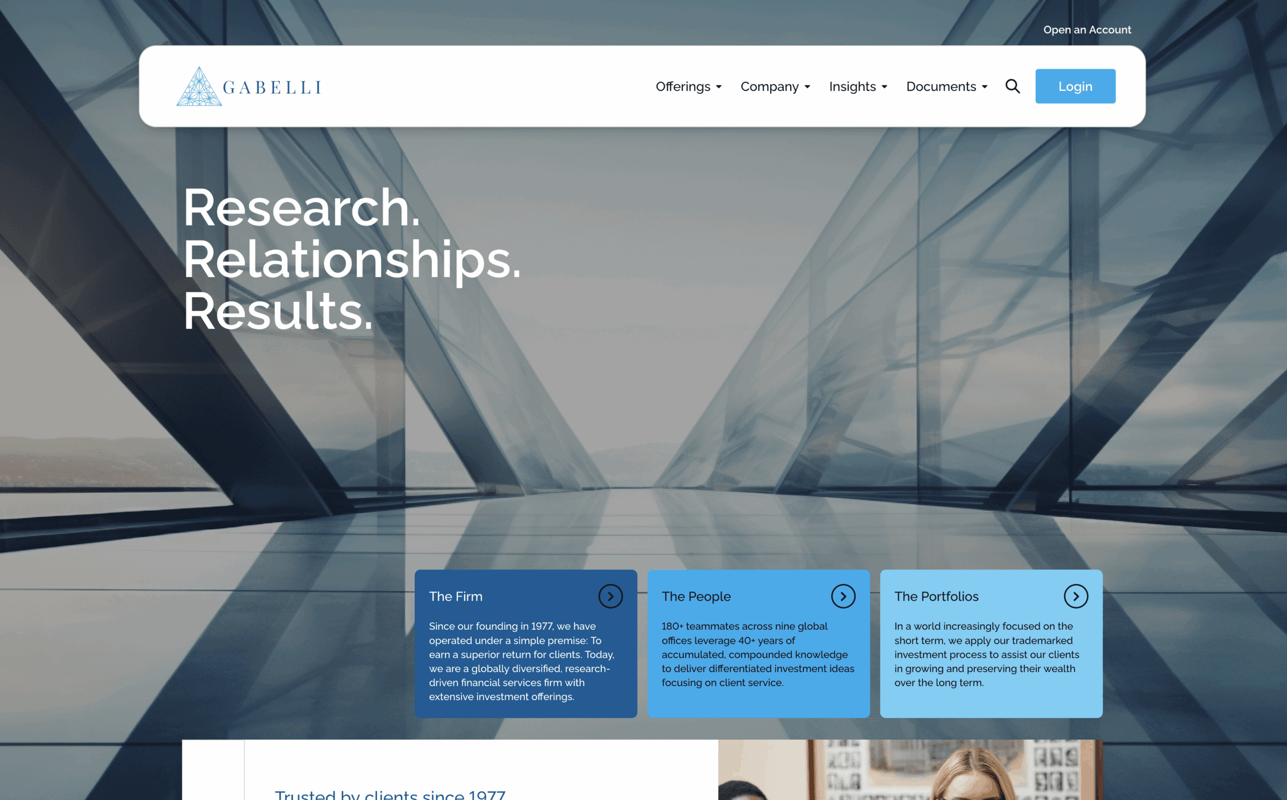
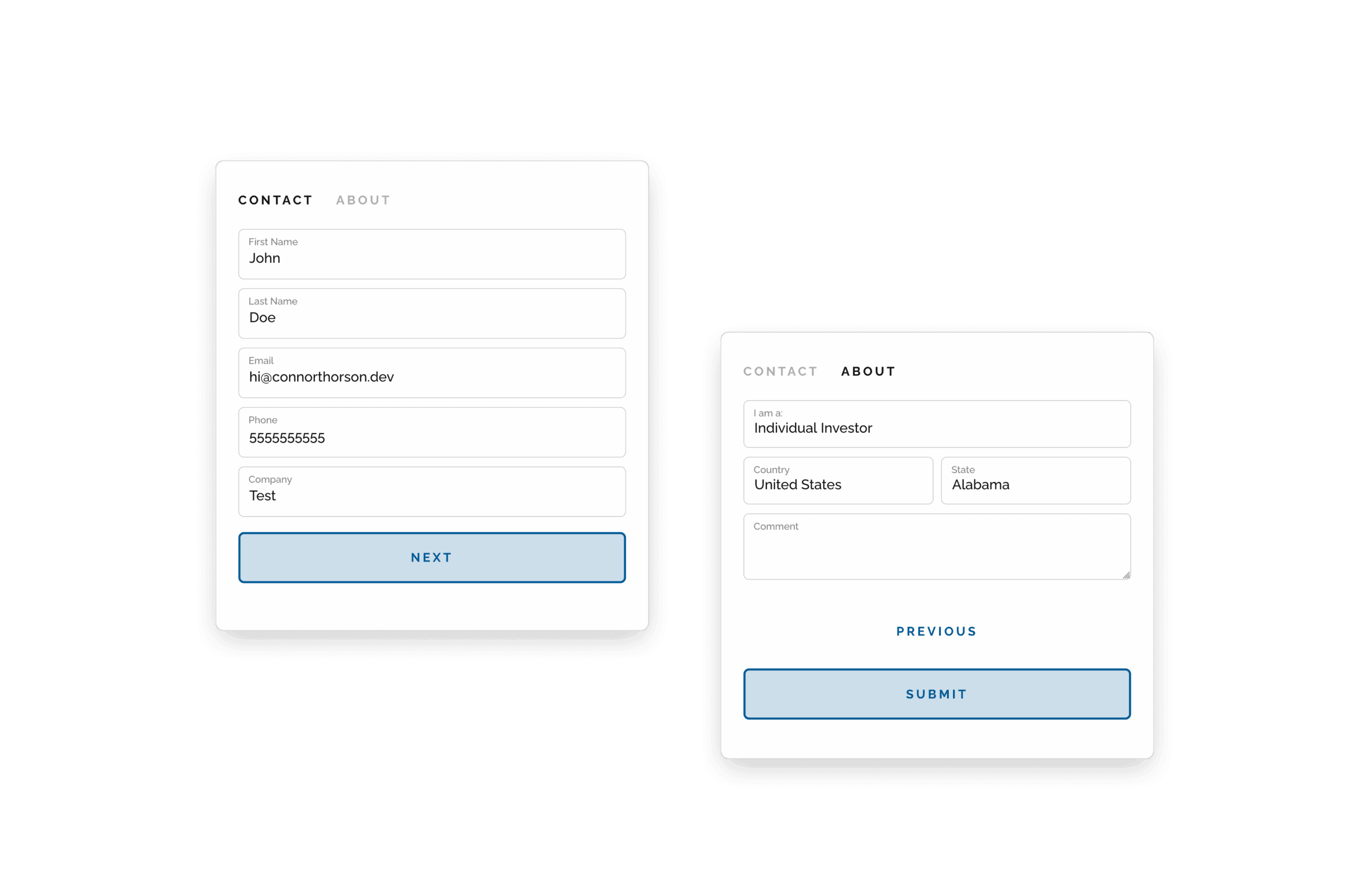
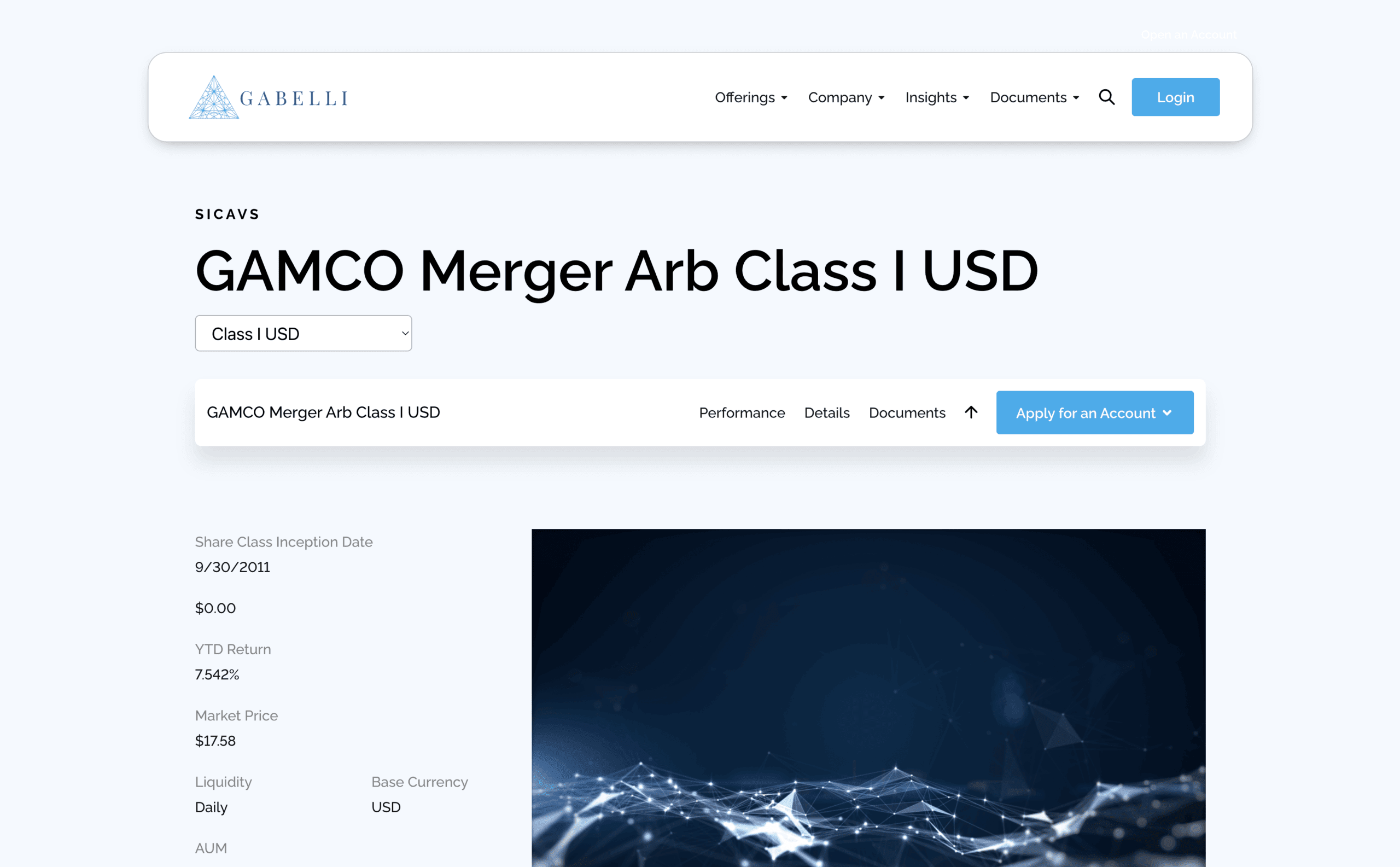
Navigation was overhauled completely. A simplified, persistent top navigation bar made it easier for users to access the most important areas of the site—such as funds, insights, and contact options—within a single click. This, combined with the use of mega menus reduced visual clutter and information overload and increased usability. Calls to action were made more visible and intuitive, encouraging users to explore or get in touch without being overly aggressive.
As the main front end developer, the site was rebuilt from the ground up, utilizing WordPress with the Elementor page builder. This allowed for rapid template development which led to a consistent layout across screen sizes, providing a vastly improved experience on mobile and tablet devices. Performance was also a priority—compressing assets, optimizing code, and ensuring the site loaded quickly without compromising visual quality.
Accessibility was another important layer of the redesign. The new site meets key WCAG compliance standards, with improved contrast, semantic HTML, and support for keyboard navigation—ensuring all users, regardless of ability, can interact with the site effectively.
Outcome
The result of the redesign is a site that feels significantly more polished, professional, and user-friendly. Early analytics following the launch showed marked improvements in time spent on site, a drop in bounce rates, and an increase in engagement from mobile users. Internally, the agency found the new modular design system easier to manage, reducing the time and effort required to publish updates. Stakeholder feedback was overwhelmingly positive, citing the cleaner layout and easier navigation as key wins.