A heritage-inspired digital refresh that blends vintage charm with contemporary UX
Overview
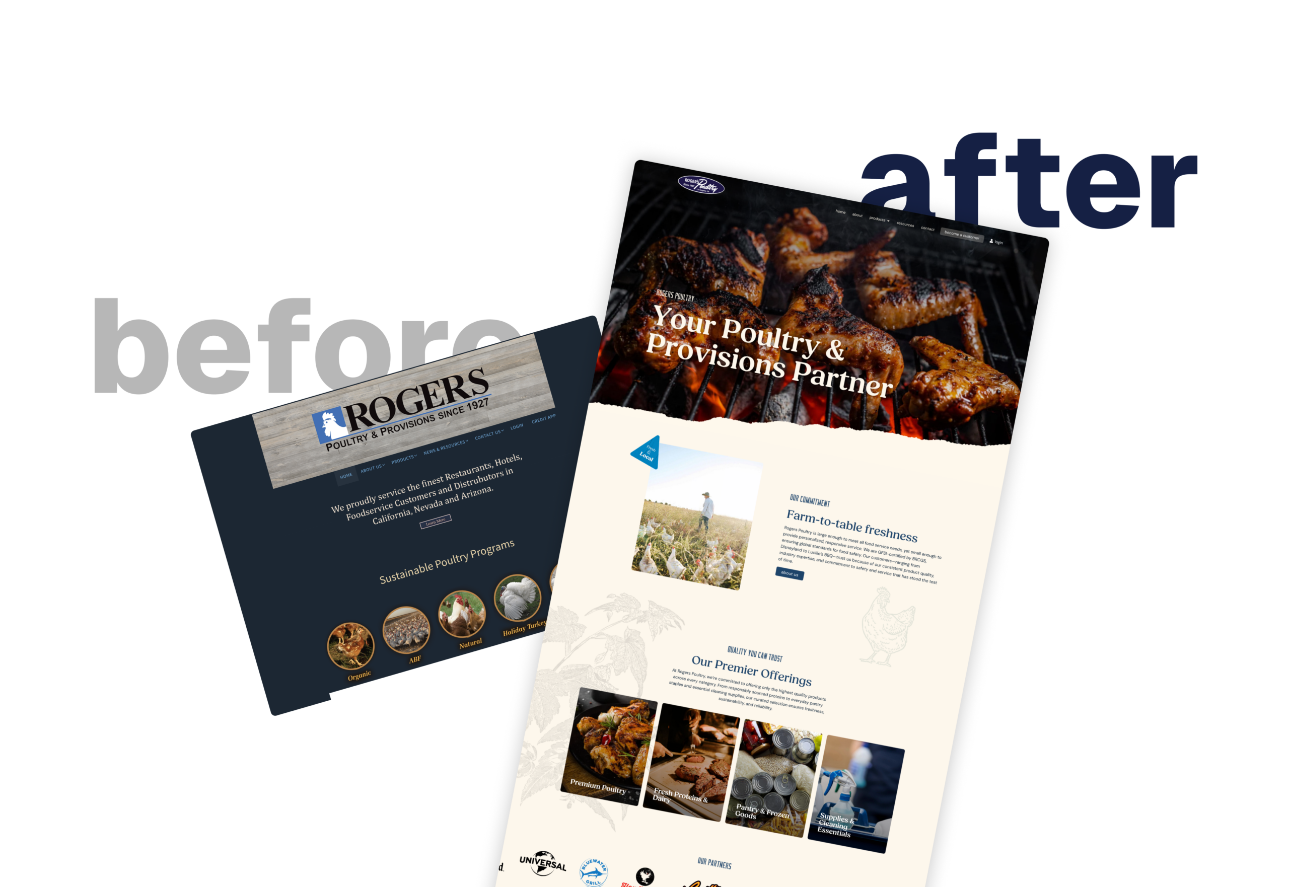
Rogers Poultry, a long-standing poultry and provisions supplier, needed a complete website overhaul to modernize their digital presence. Their existing site felt dated, had navigation and layout issues, and was not optimized for mobile. While they wanted to stay true to their brand standards and logo, the team asked for a fresh design direction that incorporated a “vintage farmers market” feel. Their vision included a streamlined menu, clear product categories, a showcase of global food safety certifications, and visual emphasis on their high-profile partnerships with Disneyland and Universal Studios.
Challenge
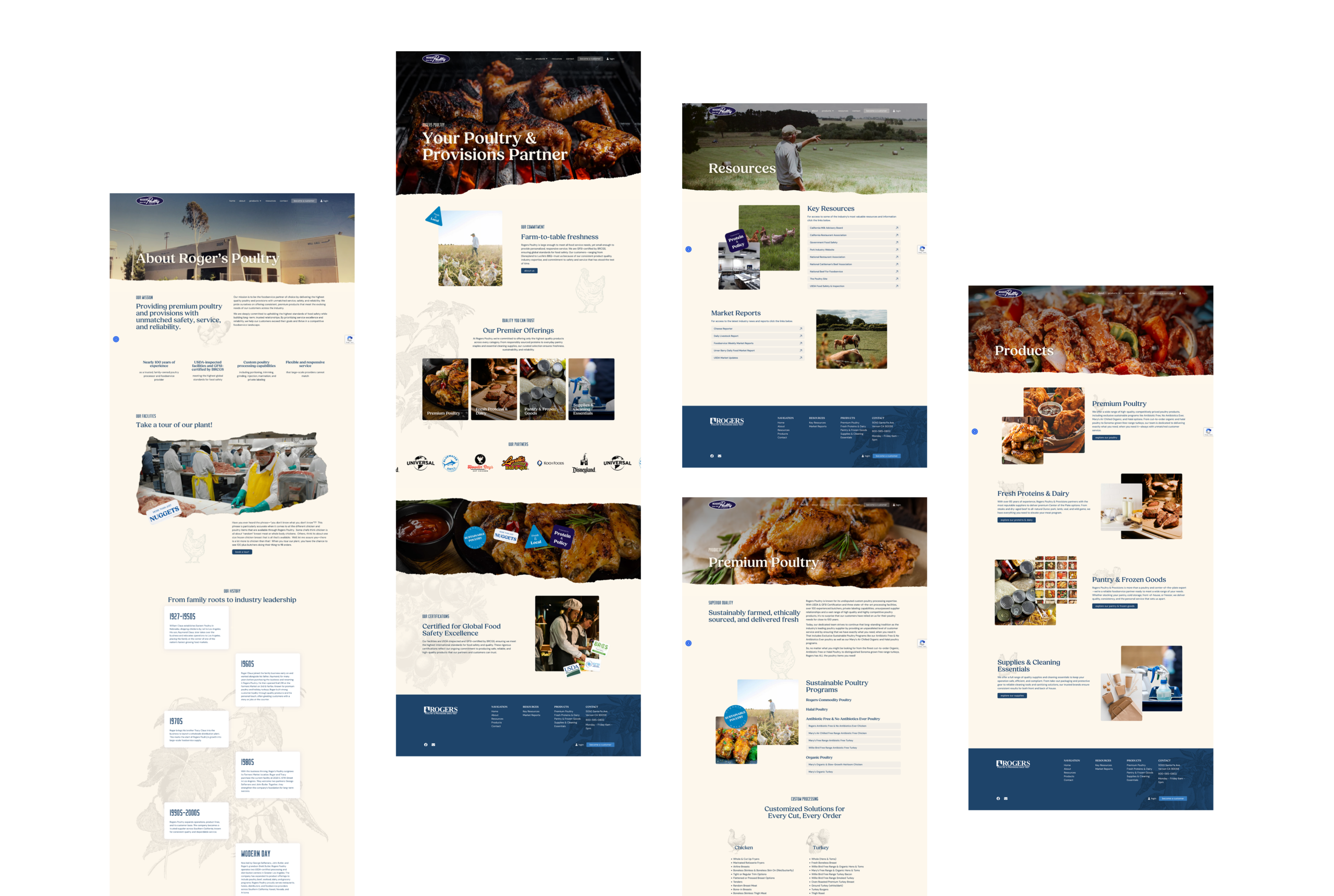
The redesign posed two key challenges. First, the brand’s existing style guide needed to be respected while introducing new vintage-inspired elements that carried a hand-crafted, playful feel. This included utilizing their existing logos, but transitioning back to an older logo in the header to reinforce the vintage aesthetic. Second, Rogers Poultry’s broad product catalog had to be restructured into four clear, digestible categories to improve usability and customer flow. Missing imagery, inconsistent layouts, and lack of mobile responsiveness further compounded the issues, creating the need for a ground-up rethinking of both design and functionality.
Approach
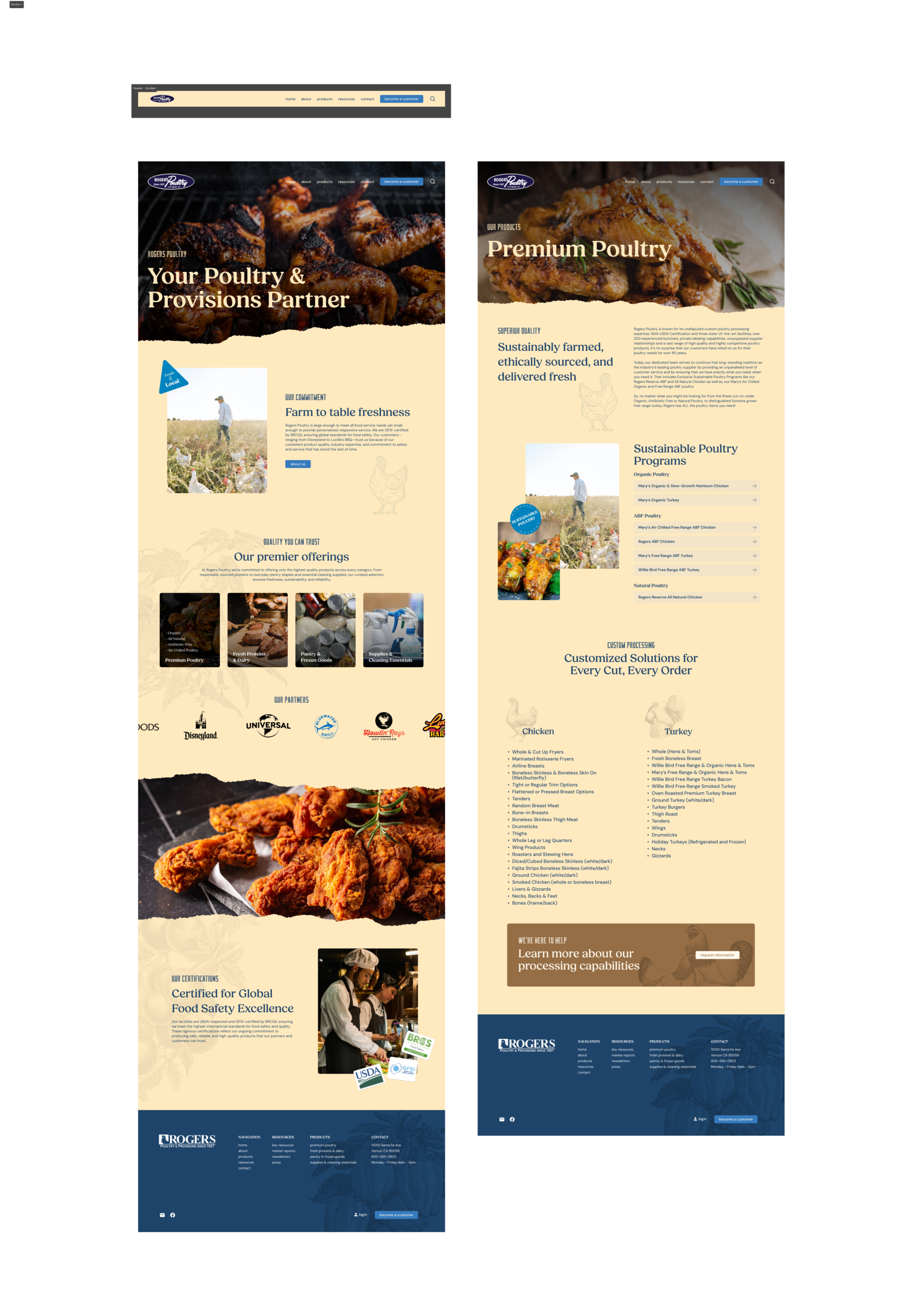
I began by mapping content priorities and restructuring the information architecture to support a simplified, user-friendly navigation system. From there, I created high-fidelity UI designs in Figma, focusing on how to visually translate the “vintage farmers market” concept while maintaining a professional look.
Key design decisions included:
-
Torn-paper transitions in hero sections to create texture and break away from rigid grid layouts.
-
Paper-masked team photos and call-to-action areas to bring a handcrafted, analog feel.
-
Background illustrations with a hand-drawn feel to subtly reinforce the vintage aesthetic without overwhelming content.
-
Custom sticker-style graphics sprinkled throughout the site to add moments of playfulness and brand personality.
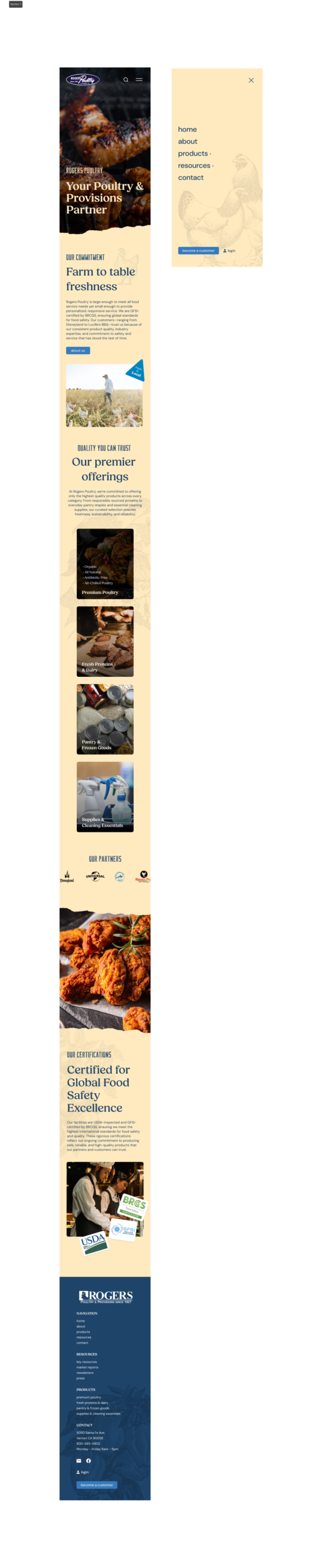
Once the design system was finalized in Figma, I transitioned into development in WordPress, ensuring the UI carried over seamlessly into a responsive, functional build. I transformed the company’s outdated credit application PDF into a dynamic, fillable online form with conditional logic and automated routing—streamlining onboarding and reducing friction for new customers.
Outcome
The final website delivers a balance of heritage and modern design, staying true to Rogers Poultry’s roots while giving them a contemporary, mobile-friendly presence. The Figma-driven UI design process resulted in a cohesive visual system that feels authentic, polished and accessible.
Navigation is now intuitive, product offerings are neatly condensed, and trust-building elements—such as certifications and high-profile partners—are clearly featured. The updated credit application form improves operational efficiency, while playful design touches give the site a sense of character that reflects Rogers Poultry’s history and personality.
Overall, the redesign demonstrates how thoughtful UI design can bridge tradition with modern usability, giving Rogers Poultry a platform that supports both their legacy and future growth.